Liu Junde has created a data browser you can use to draw things from the CGED-Q database of Qing officialdom.
Here is a description posted to Facebook by Cameron Campbell
An HKUST undergraduate in our Quantitative Social Analysis program named Liu Junde took the CGED-Q 1900-1912 Public Release data and created a data browser to do simple tabulations and charts. He originally did it over winter break on his own, and when he came in and show it to me, I hired him as a student helper to make some changes and prepare it for wider use. It has now reach the stage where we are ‘beta testing’ looking for people who might want to try it out. Take a look if you get a chance. It is currently hosted on a server that can probably accommodate roughly 10-12 users simultaneously.If it doesn’t load right away, wait half an hour or so. Junde periodically has to upload revised code to the server.
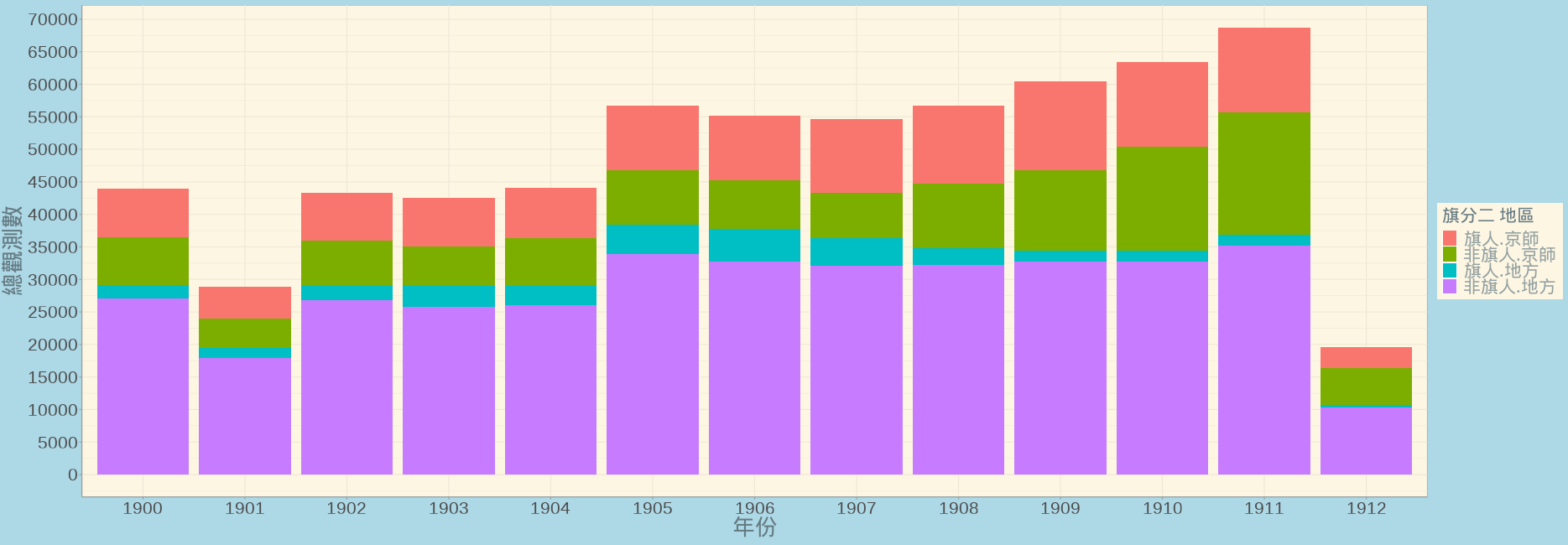
Here is a breakdown of banner and non-banner officials in the capital and the localities, 1900-1912. This is more something I would use for teaching (rather than switching to being a Qing person) but even at that level it is a great graphic for showing the growth of the government in the New Policies period and the relative decline of the banners in the last years of the dynasty. It also brings up questions like were were they getting all those bannermen from? There were plenty of underemployed exam passers, but was there really a reserve army of unemployed educated bannermen? Or were they lowering their standards?